Buyers Remorse v Happy Mail
Hi all. Jen G here with a slightly unusual theme to my post : buyers remorse. Have you ever ordered something online, opened the package, then thought “Why the heck did I order this?!” Stick with me on this one! 6 weeks or so ago I ordered a range that caught my eye because it had “real” red in it. I’m a sucker for a range that has red in it. Not pinky red or orangey red – RED red. I also love Simple Stories – who doesn’t? So I ordered the Simple Stories “Sea to Shining Sea” range. When it arrived I realised how very themed it is. It’s a 4th of July celebration range basically. My first thought was how the heck do I use these on my very non-American photos? So I started to “de-theme” the products. By carefully cutting the papers and layering stickers in certain ways I could remove most of the Independence Day references.
I began with a picture of my littlest man graduating from Reception. Along with the “Sea to Shining Sea” papers I popped a Freckled Fawn “This” paperclip on there and a Jillybean Soup Wooden Nickel.

Next came my Man of the Match.

I carefully cut the points off an anchor sticker to make use of the arrows. I stitched the star onto the cardstock first, then layered the elements on top. The American Crafts Glitter Thickers are a perfect red – RED red 🙂


This picture of my lovely little niece suited the papers perfectly. Again, by carefully choosing which elements to use I could remove any hint of the American theme. A couple of old eyelets and stickers from my stash complemented the page perfectly.

Next I used a picture of my whole brood. I created a sunburst with papers from the range and then framed that with MME and Freckled Fawn washi tapes. A few stickers from the Simple Stories Icons set added the final touches.

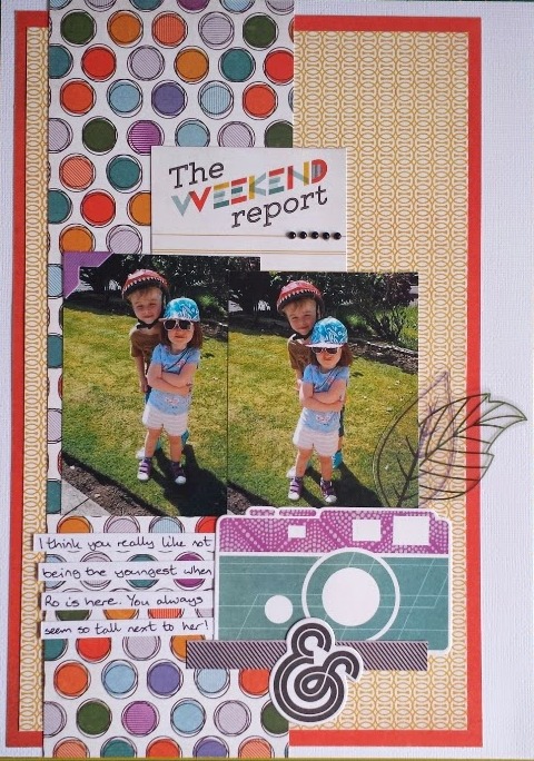
There is actually a tiny hint of the American theme in this one. Can you spot it? Lots of layered elements made this a quick page to put together.

Last of all I used another picture of my 4 crazies! More carefully layered papers and some Freckled Fawn washi tapes made for another page with not a hint of the American theme.

So that is a total of 6 pages using a very themed range yet barely a hint of the theme in the layouts. I actually ended up really enjoying the challenge of de-theming the range. I hope you like the results.
On a totally different note, my next order was packed full of products that I was in love at first sight with. The Basic Grey Kelley Purkey “Second City” range is TO-DIE-FOR. Seriously. If you don’t own it yet, order it today. The papers, the frames, the overlays… seriously gorgeous. Here are three of the pages that flew off my desk within days of delivery.


I am currently still working with this range and suspect I will reorder it.
We would love to see your work. Please leave us links to your pages using ranges you have either found challenging or that you have loved working with.
