Double the fun!
If you are anything like me, you’ll often get the idea for a project that requires more than just one scrapbook page. We’ve recently enjoyed renovating old furniture for our new home together, and I wanted to document the “befores and afters” but I had far too many pictures for just one page.
I firstly considered a mini book, with the idea of being able to add future renovations to the book at a later date. However after a quick shifty through my craft room, I uncovered several unfinished minibooks from years gone by that were all started with equal good intentions, and I realised that open ended projects aren’t really for me either.
And so I decided on creating a double layout. It’s something I’ve done twice in the past, but having never really been happy with my results it’s not something I’ve largely explored. So I had a close look at the two I had made and analysed what I was mostly unhappy with, and it was the lack of cohesion or togetherness, whilst still maintaining a balanced feel, that made me uneasy (read *triggered my scrapbooking OCD*). So being the kind and generous little old soul that I am, I thought I share with you how I decided overcome this and make a double layout I was happy with 🙂
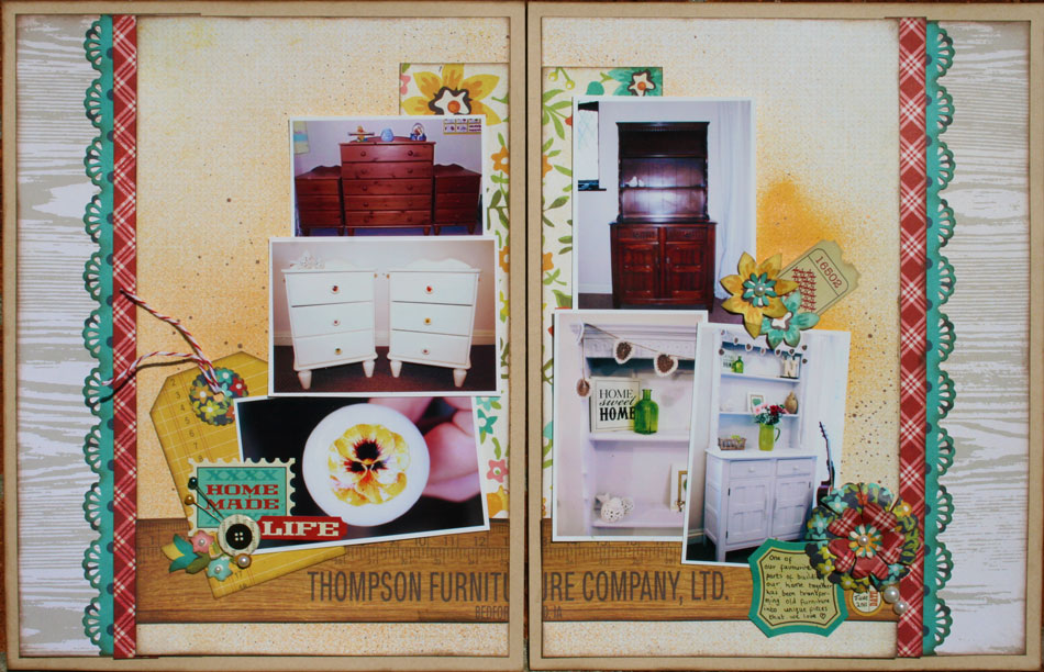
Here’s my completed project:
Click on any of the photos to view a larger image
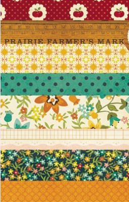
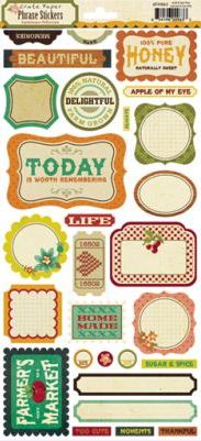
I used the gorgeous Farmhouse range from Crate:
Its warm colours and retro floral prints were perfect for my home DIY theme, and the
Farmers Market sheet of paper was particularly ideal as one of the rulers in the design had the words “furniture company” etched across it! Yay!
Whilst looking at my double layouts (DLs) from the past, I realised that I’d found working on two 12×12’s too large and daunting, so firstly decided to create 8.5×11 pages – when put together this gives you more space than a single 12×12 standard page, but doesn’t take you too far out of your comfort zone. So my first step was to cut two pieces of background cardstock down to this size for my bases.
The second thing I noticed was, as I mentioned earlier, the lack of balance and cohesion. My DLs just looked like two separate pages that just happened to use similar photos and the same papers. So to overcome this, I decided that I would treat my two pages as one really large one, with all the “action” happening at the center of the design.
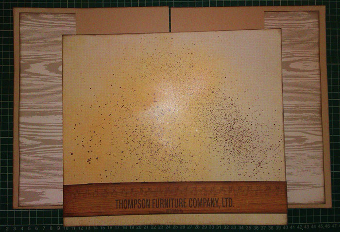
I chose to use the rear of the Homemade paper as my background, and so for now layed it centrally on the base pages to help me envisage my design and to help me focus on treating my double layout as one page.
I spritzed it with a little
metallic lemon and brown Maya Mists, before cutting the ruler I’d spied on the patterned paper and sticking it across the sheet. Laying it gently back on the cardstock bases, I used this as a guide to cutting strips of
Wood Grain patterned paper from Studio Calico’s Classic collection for either side of my pages, to help fill the page and create that balance I was striving for:
I then added a wide strip of the lovely floral Countryside paper to the middle of the page and tucked it under the ruler strip. When I was happy with this background I had created, I cut the misted/layered Homemade patterned paper in half, and adhered one piece to each base page.
Next, I arranged my photos as central and as balanced as possible – near the the join of the pages and tumbling down in a sort of pyramid formation – as roughly equal visually on both sides.
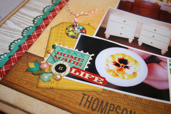
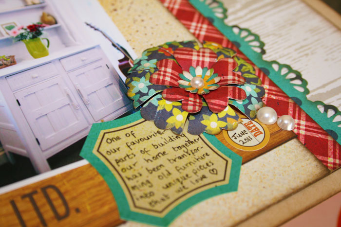
Similarly, I made sure my embellishments were balanced. I created a tag from some of the patterned paper (inspired by fellow DT member Helen), and used it as a mat for my title, which I created using some of the lovely Phrase Stickers in the collection.
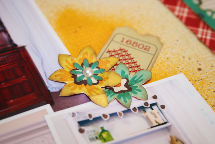
As well as using the phrases and journalling spots to embellish, I also hand cut flowers from the paper, as well as creating my own by layering up punched shapes, as seen here:
Narrow strips of paper ran through an EK Success Double Crochet Lace punch finished off the outer sides of my pages.
So, if you are thinking about taking your first tentative steps in to the world of Double Layouts, these would be my top five survival tips:
1. Create an 8.5×11 DL
It gives you more space than a single 12×12 page, without becoming overwhelming.
2. Treat your design as one whole page
This keeps the design balance and makes clear that the pages are part of the same project.
To achieve this, create your background as a whole sheet and then cut it in half to be adhered to each page.
3. Place your photos centrally on your design
Have them as close to the “centre” page edges on each side as possible. Keeping them here again makes your DL appear as one enlarged design, rather than two separate pages.
4. Balance your embellishments
A bit like algebra – whatever you do to one side, you must then do to the other!
5. Stand back and check your progress
Propping your work up and viewing it from a few steps back can help you see your work properly and gives you a better feel of the overall balance and layout of your page.
I hope this has inspired you to give a Double Layout a go – we’d love to see anything you create so please feel free to link back here and share it with us 🙂