Posh mixed up
I chose to work with the gorgeous Posh line from Simple Stories this month. Simple Stories are one of my very favouite manufacturers, and always seem to come up with new collections that I love. Not being one to usually stick with a single range when I make my layouts, I decided to mix it up and make 3 pages featuring Posh with other recent collections.
Simple Stories Posh
Dear Lizzy Saturday
Shimelle Go Now Go
Crate Paper Cool Kid
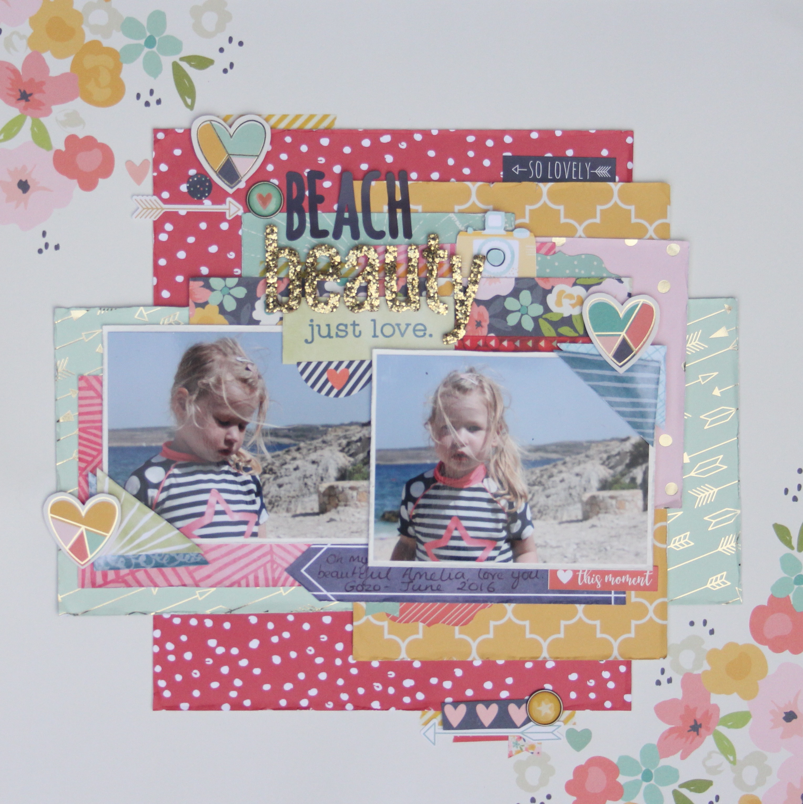
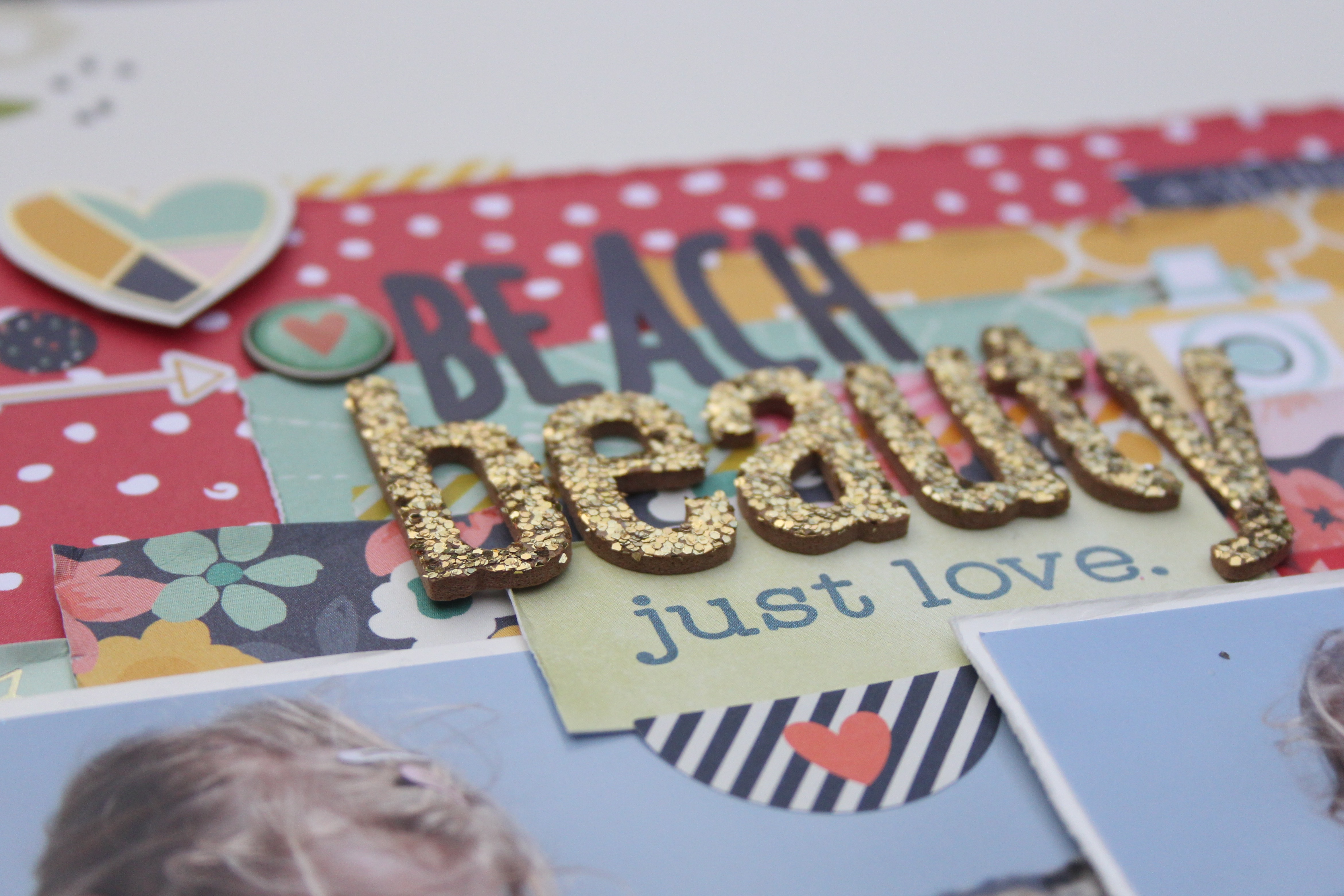
For my first page, Beach Beauty, I mixed Posh with Saturday from Dear Lizzy. This has some similar tones of navy, green, yellow and aqua. The red and white dot wasn’t an exact colour match, but I felt it blended in well with the darker pinks in Posh. The two photos are of my daughter, then 2 years old, on holiday earlier this year looking salty and sandy and windswept and beautiful! The navy accents on the page pick up the colour of her top, and come from a mixture of the two paper lines. I ran my fingernail along the edges of the papers to give them a slightly roughened look. A file tool or nail file would give a similar effect but I just find it quicker and easier to use my nail.


Secondly I pulled out some of the Go Now Go collection from Shimelle for American Crafts. Again this features navy and a pink, along with some yellow, green and a gorgeous deep red. I used just small amounts of the red but it adds a lovely pop of colour depth to the page. Whereas the Posh collection has gold foiling, Go Now Go has copper accents. I had no qualms about using both metallics on the page together, but you could happily just choose one if the thought of mixing them together gives you the shivers! I love the scratch off stickers in Shimelle’s line – these are such a fun addition to the range, and something I’ve never seen before.
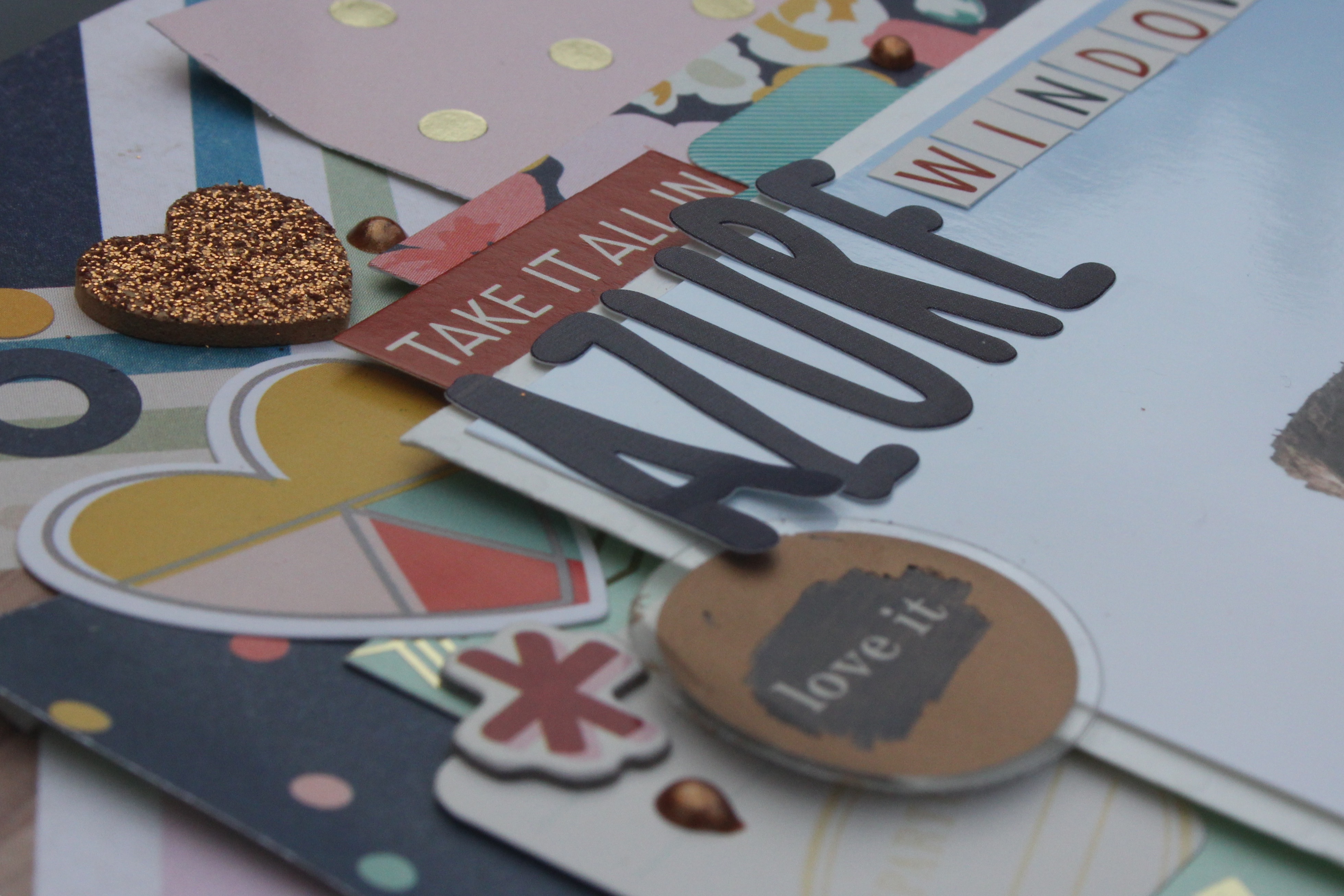


For my third and final page I mixed Posh with Crate Paper’s recent collection – Cool Kid. Initially I thought I was going to struggle, because really only the navy and yellow appear in both ranges. There are blues/aquas in both but they are quite different tones. However, I decided that it was virtually impossible to clash blue with blue so I went ahead and used a whole variety of blues from both collections. Adding kraft cardstock gave Posh quite a different feel, and it immediately felt more masculine. I almost completely left out the pinks, just using small touches of the red/salmon shades, and focused on the blue and yellow tones layering up die cuts and stickers. A chipboard frame picks out the most important part of the photo, but without having to trim it down in size and loosing all those pebbles, which are part of the story (he was eating them!).


Across all the pages I’ve used cut out hearts from Posh (and some from Go Now Go), tiny stickers from the Posh Planner Basics Stickers pack, skinny washi tape from Amy Tangerine Better Together, Posh combo stickers, and adhesive bradz.
You can find links to the collections I’ve used at the top of this post.
Thanks for reading!
