The Collection Pack Challenge – Basic Grey
Hi everyone and welcome to my April blog post, and there is defiantly a feel of spring in the air. This month I decided to challenge myself and use a paper manufacture that I had been neglecting for a while, Basic Grey. When I first started scrapbooking about 8 years ago Basic Grey was the first ‘proper’ scrapbooking paper that I brought, and I just loved their distressed edges on their papers. I will be the first to admit though that I turned my back on it a bit as I was swayed by all the beautiful and shiny other paper brands out there. When I saw the Prism collection come into the store, I knew it was time to rekindle my love for Basic Grey. I have filmed a video where I share the papers and embellishments for this collection, and what I challenged myself to use. I will admit that there was one paper that I really disliked, but in the ended it became a feature of a couple of projects, the video can be found HERE.
So I decided that I was going to focus on just using this collection, and really limit the use of my own stash. I always find it a challenge to stay focused on just the kit, but I am so glad that I did as these pages are some of my favourites I have made in the last couple of months, and the colours just shout spring. So I will be sharing with you 4 pages and 5 cards that I made, there will be videos for all of these projects on my YouTube channel over the next week, I will also share in the finial video the bits that I had left. So here we go, prepare for a picture heavy post.

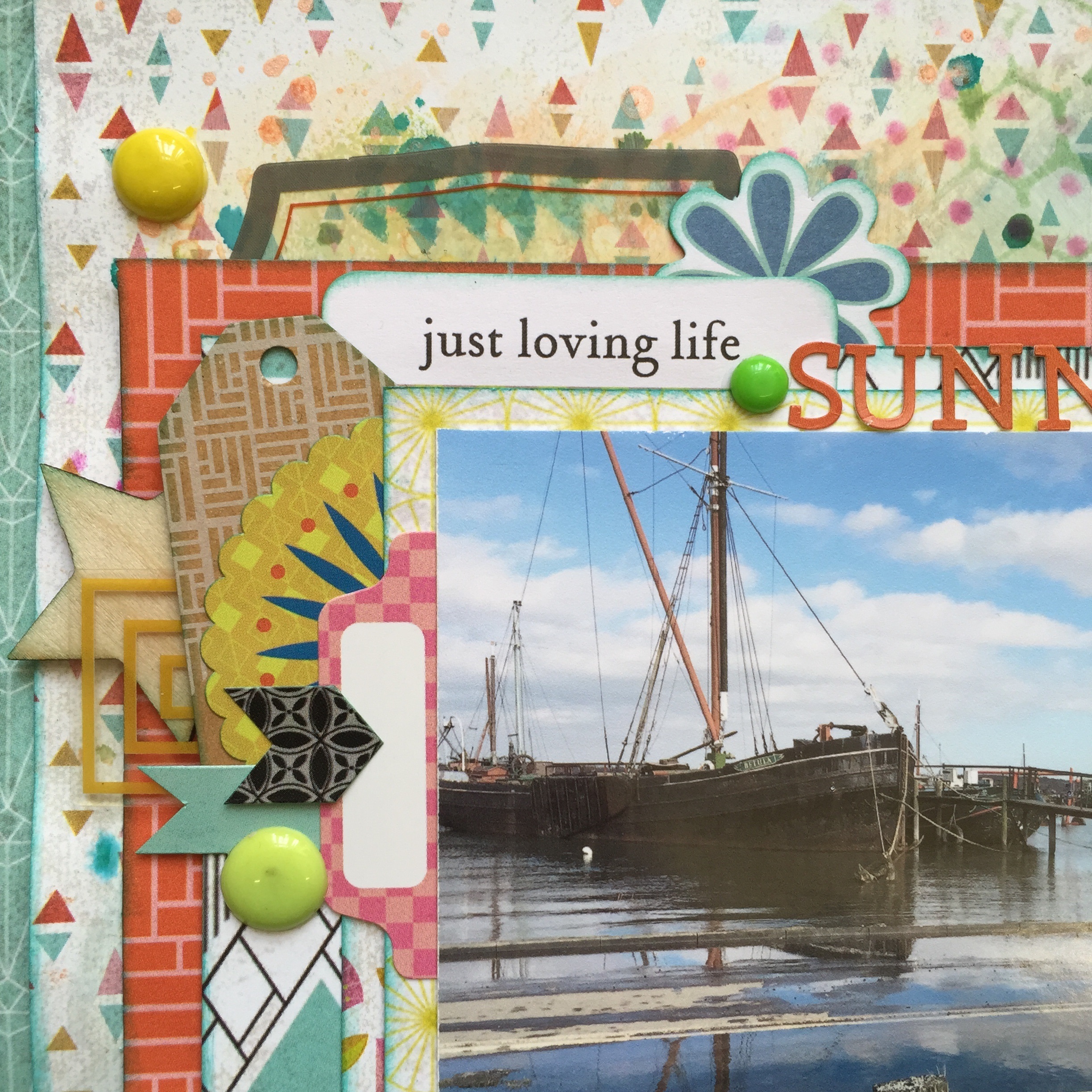
When looking at the collection I knew there were certain bits of paper that I wanted to make a feature of, as backgrounds, and this first piece of paper was one of them. I love the bold geometric patterns and shaped in the collection, but of course for my taste things can never be bright or busy enough so I set about adding some texture to the background using masks and inks.


The colours are so bright and fresh that I really did not need to add much to this first page, other than a couple of embellishment clusters. I really like how the embellishment packs include acetate pieces as well as cardstock, the only thing I added to the page was some homemade enamel dots given to me by a wonderful friend.

I can of course not mention how fab the alpha stickers are from this collection, I will admit that they are a lot smaller than the alphas that I normally use for titles on my pages, but it did mean that I could add longer titles. I have loads left and they will be perfect for using in project life too.

For my next page I wanted to add some texture to the background, the papers are a good quality but to try and limit the inevitable warping I added a thin layer of gesso to the paper. I added over the top of this a mixture of Distress Inks and watered these down. I then set about building my main photo cluster on top.

I love how all the papers on here clash, but as they come from the same collection they match together well. I did gut out the middle of a couple of my papers as it meant that I could stretch the collection pack further, of course if your style is not to frame your pages, then you could have easily got another one or two pages form this collection.
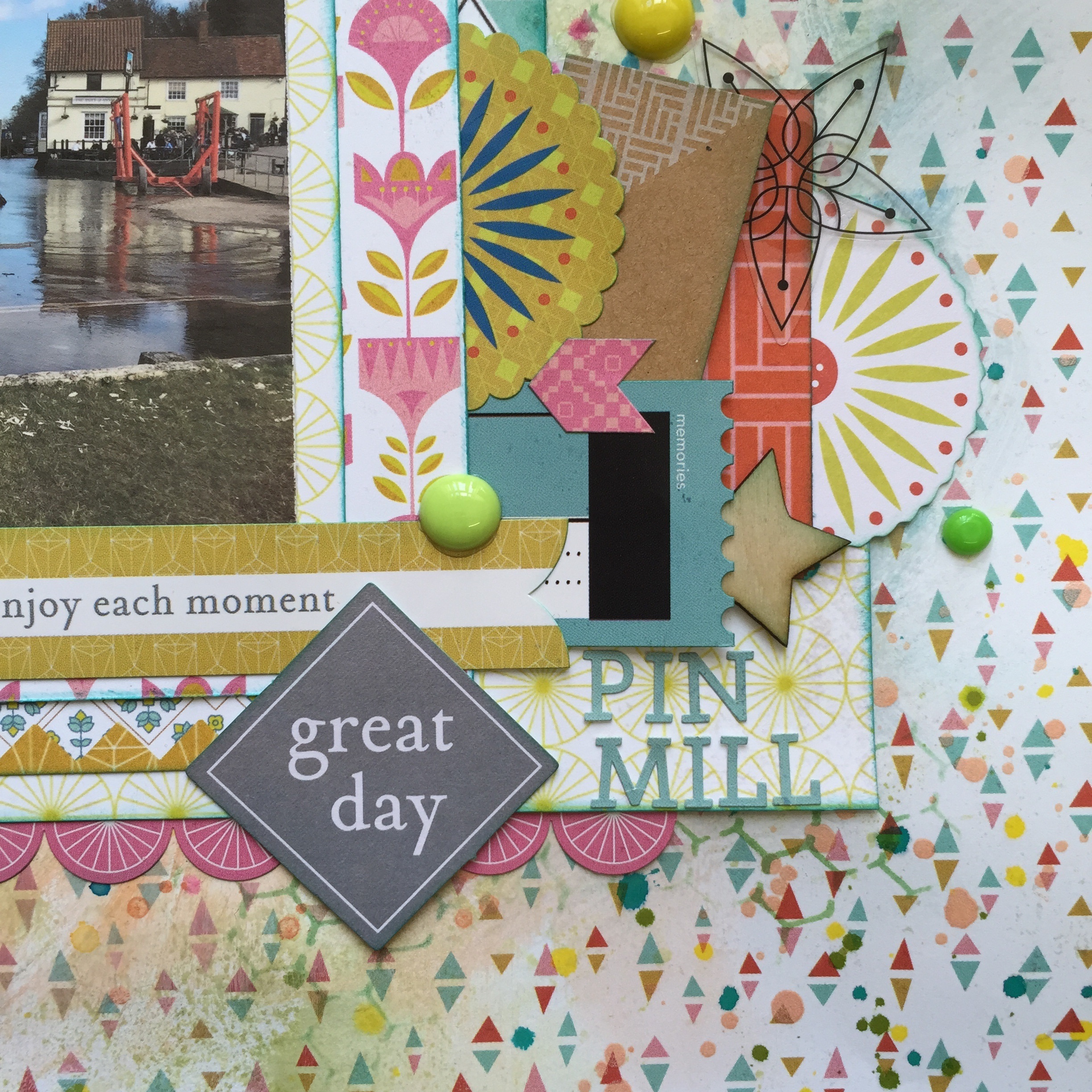
The only thing I added from my stash this time was a couple of wood veneer pieces; I love how it adds a beautiful texture in with the acetate pieces and the stickers from the elements sheet.

My third page is using this amazing paper as a background, I love it so much, and even have added another sheet of this to my stash, I wanted to use up a lot of the lovely branding strip pieces, and strips from where I have cut down some of the other papers.


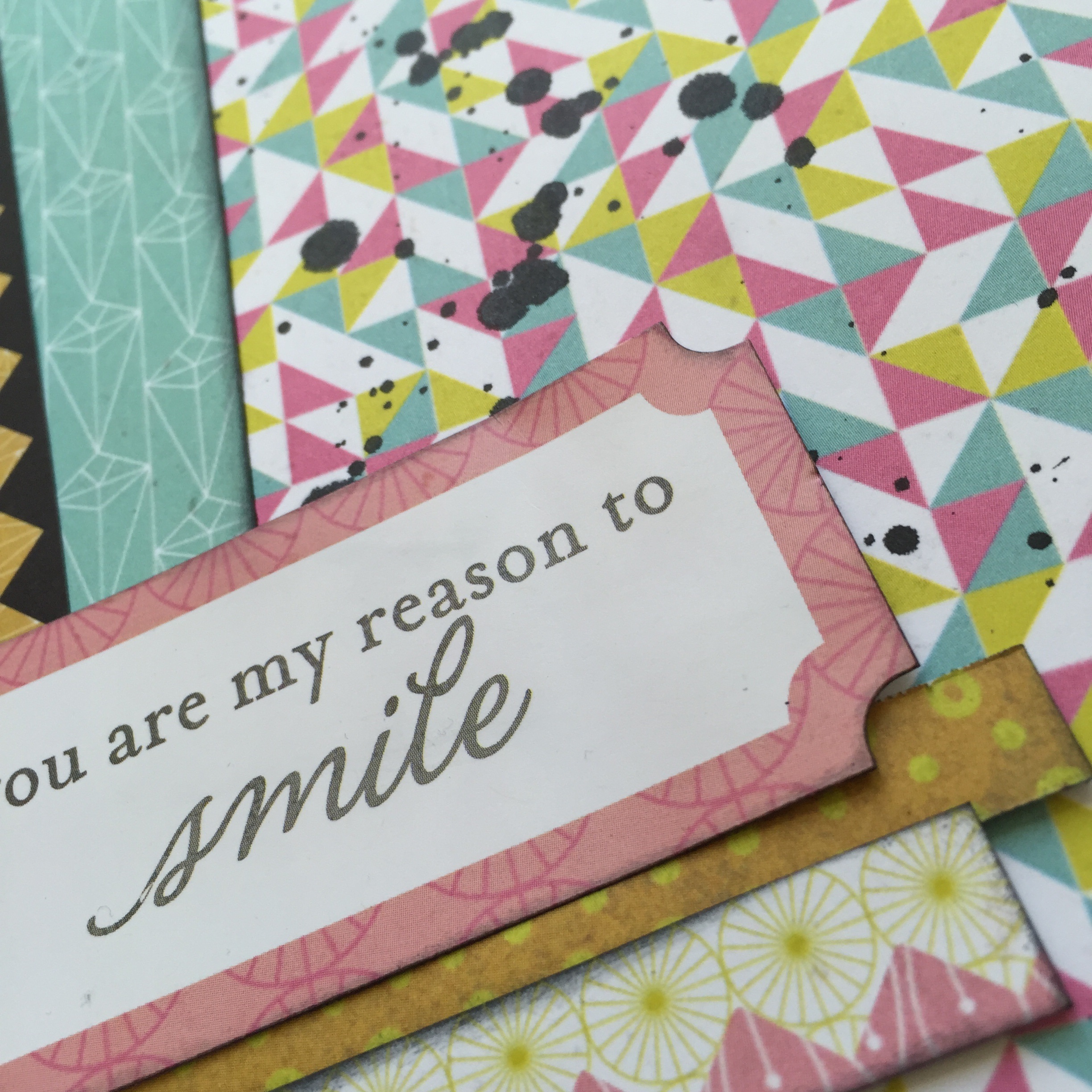
As the background was so busy I have added black ink to all of the edges to help all the elements stand out. The kraft tags from this collection also help to bring a natural element to the page. The stickers in this collection also come with some great sentiments and sayings and make for great titles.

My fourth and final page for this month is something a little different for me. I love this dark background paper with the geometric print over the top, and wanted to use this to make a bold page. As I mentioned the bold geometric designs are not only featured in the paper they also feature in the embellishment packs. I often struggle to use up the smaller elements, like the triangles, so decided to make a disjointed layout where these could all stand out against the background.


I also combined one of the stickers, with an acetate piece and some of the alphas for my title, and could not be more pleased with how it came out. I have left the pink square at the bottom blank as this is where I will add my journaling, I like to wait till when I am putting my pages in albums before adding my journaling as it means that I can make sure the whole story is told, and I am not repeating myself across pages/project life.
After making these pages I had a few decent size scraps so I decided to make some cards, as you can see form my last few monthly blog posts cards are something that I am starting to make more of. I am finding they are great for using up the papers that are left on my desk after a project. I also found that some of the embellishments and tags were great for adding sentiments to my cards.

The first 4 cards are using some images that I have coloured recently and were waiting to get on cards, the papers in this collection worked really well. I even used the piece of flower paper that I really disliked; I think it gave the cards a more retro look.


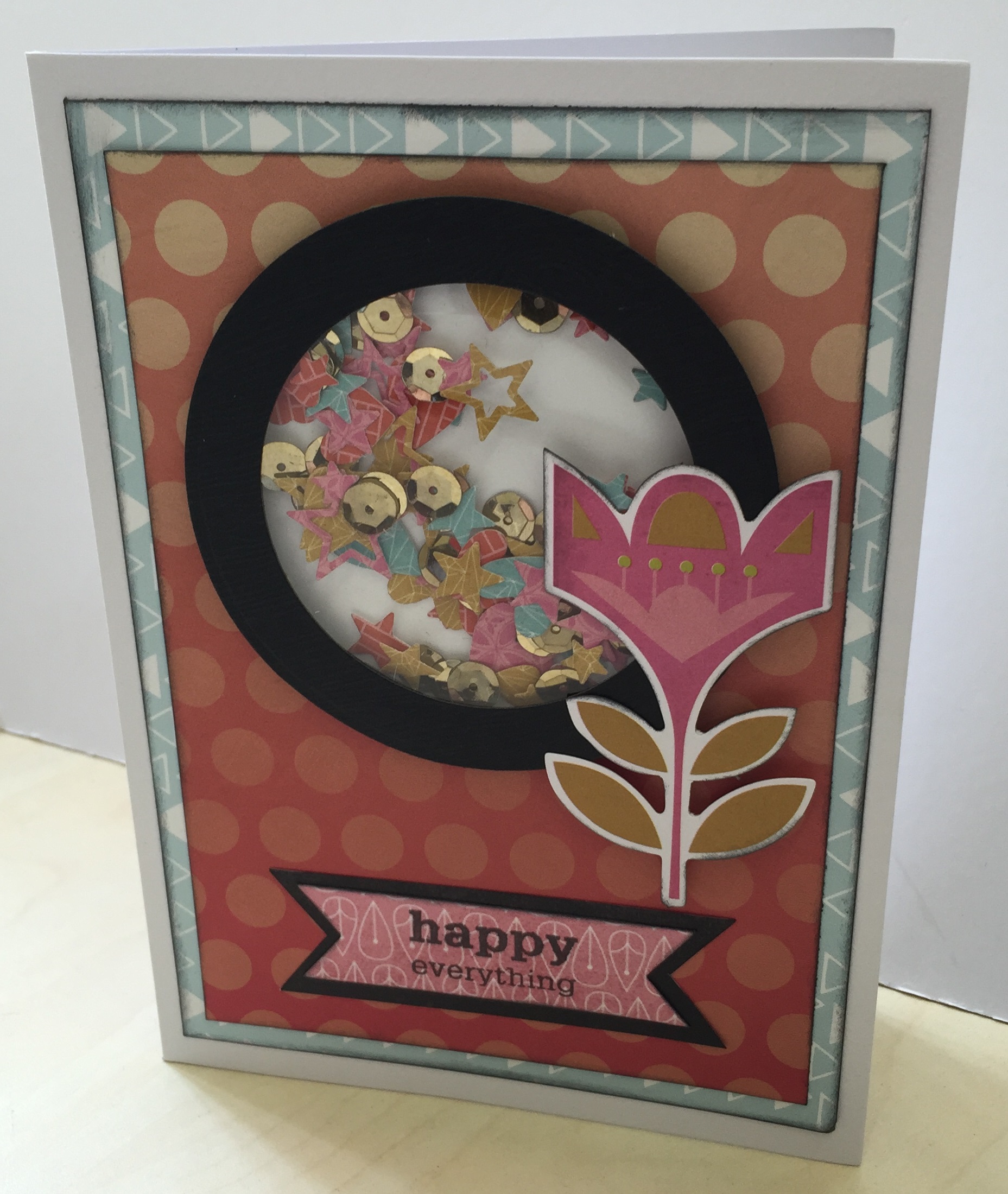
For the finial card I made I decided to make a shaker card, this was my first attempt and I am pleased with how it came out. I used the front sheet of the collection pack, which showcased the designs in collection, and some dies to make the confetti. This packaging sheet of course is not the same quality as the patterned paper, but it still sturdy enough to be used for this purpose. I really enjoyed making my own confetti to use in this project using some dies that I picked up from the store in their recent offers. Although the paper on this card is from an older Crate Paper collection it worked well with the colours from this Basic Grey collection and the flower die cut I decided to feature. There is a few more die cuts I have left which I think I will also turn in to feature elements on cards.

So that is the collection pack killed, I have the alpha and element stickers left mainly, as you just get so many, so I will be adding these to my stash and seeing how I can get them to work on future projects. I hope you have enjoyed seeing the variety you can get from the collection packs and what I think are great value and a great way to challenge yourself.
I hope you all have a fabulous April and I will see you all in May.